Search This Blog
Friday
Shoot 6
Having some trouble deciding whether to put these photographs in a warmer hue, which will obviously make these photographs look more exotic, or opting for something a bit colder and more dramatic!! It is very hard as i like them both for different reasons.
Monday
Krystal London Shoot
The softness of the background helps the necklace sand out.
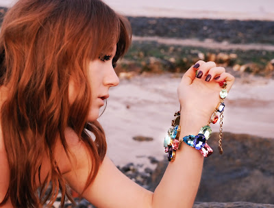
THis is one of my favourite images from this shoot. The amazing blue from the necklace has reflected into the models eyes. we purposefully placed the model against the rocky background to bring out the details in the necklace.
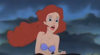
If you see further below, i have taken images from the film The Little Mermaid. In the images often her hair takes up most of the frame and i felt that the colour of my models hair brings out the colours in the necklaces/compliments them.
These images are simple and to the point, it is more about the whole scene as opposed to what the model is doing. This is why i have chosen to create a beauty shoot.
These are the chosen images that i have put into black and white, just to experiment to see what it would look like. Obviously as the colours of the jewellery are part of the selling point i felt that it would detract the attention away from the jewellery.
These are some quick drawings i did, to get an idea of what i want to get when i do the shoot.
I want a disheveled look to my model as i want her to look 'washed-up' but not wet. I am thinking of the kind of hair your get after being on the beach all day.
These are some shots i did over my research of the seaside. I feel that the very bottom photograph fits into my idea a bit better, therefore, I will ensure i organise my shoot for when the tide is out.
The images below were taken from a website called CLM, which was recommended to me by Kim Howells. I was interested in finding out about photographs who create modern, fashionable beauty shots this site along with the amazing photographers below has really inspired me to see beauty shots in a more modern light. I am collaborating with a designer who creates amazing jewellery (as stated further back in this blog). I have never worked with a shoot based on jewellery and as it was part of the brief to collaborate with another creative i felt that venturing into my unknown would help me experience new challenges.
The above photos, are natural and ooze simplicity, i feel that for a shoot focused on jewellery made from beautiful crystals, should be simple like the above. I want the viewer of the images to feel like they are there in that location with the model. Like they are right next to her and are encapsulated by her beauty and by the amazing pieces of jewellery she wears.
I want this shoot to have quite a commercial element to it, as i feel that i want to create a shoot that sells the jewellery.
Tuesday
colour shoot
These are my final images that i have picked. Each photograph has been chosen as they each reflect the harsh, strong and powerful look i set out to achieve.
I found this jacket in a charity shop and i knew it would end up in the shoot. The brightness mixed with the blue made the image look powerful and helped to reinforce the primary colours that i have been inspired by.
This outfit was inspired by Bubble gum. I love Guy Gordin's film that i have already spoken about, and at first i was a bit reluctant but looking back at his video of the woman in pink against a similar coloured background, it just worked so well, and i feel the above image looks great as well.
I love the blue and the pink together i feel that they work well. I feel like it is like a cartoon in the sense that there are no details, and just one colour. I also feel that the outfit has succeeded in looking quite elegant.
This is my Studio shoot so i am very nervous as i have a whole team with me and a two hour slot in which to do a whole shoot! Therefore, i have to be particularly prepared as i can not not get this right as the slots are few and far between!
I have looked at Guy Bourdin's films for inspiration as he often uses bright bold colours in his work. The film below has prompted me to use a pink back drop for my shoot as it really shows off other colours and looks bright when light is on it.
http://www.youtube.com/watch?v=Nwzoz7Uv6qk
Madonna famously used his work as a reference for her video Hollywood, and after watching it back i really feel that using a pink background would make it all look very good.
http://www.youtube.com/watch?v=KI2EPq3MV5Q
For poses and inspiration for my shoot i have looked and creating an image that continues the theme of blocking. I have turned to children's shapes in the hope to create a shoot that reminds people of primary colours and fun.
When you look at the images below, one by Van Gogh and the other a child's toy you get a sense of simplicity and carelessness. The colours do the talking and create the feeling which is what i want my shoot to reflect.
Subscribe to:
Comments (Atom)


